Mozilla Firefox gets a completely redesigned. Mozilla has called the new project 'Australis'. It is the next iteration of the Firefox user interface. According to Madhava Enros, who leads the Firefox User-Experience design team, it is not yet finished and needs more polish. He also explained on the official Mozilla blog what the 'Australis' update is:
"1. It's the most beautiful and detail-obsessed iteration of Firefox’s visual design yet: modern, clean, and comfortable
2. More fundamentally, it’s a streamlining and simplification of the default interface, to declutter and better focus on how people use a browser today.
3. Finally, it includes a new simple way to customize the browser and make it your own."
Here's the new look:
The new persona with Glowbug theme installed. Source
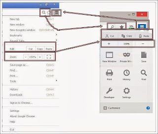
That's how the new Firefox Australis is. We think it is nice, and we checked out some of the user response. Some users like the new change and prefer it this way, while some prefer older Firefox interfaces. There have been several users comparing the new interface with the interface of Google Chrome. We have, ourselves did a small comparison:
Google Chrome(Left) VS Firefox Australis(Right)
A comparison of Firefox Australis(First), Google Chrome(Second) and Firefox 25(Third)
What do you think about the Firefox Australis? Is it similar to Google Chrome? Leave your opinions, comments, suggestions and issues in the comments section below!
~Muhammad Junaid~


 1
1 2
2 3
3 4
4


